

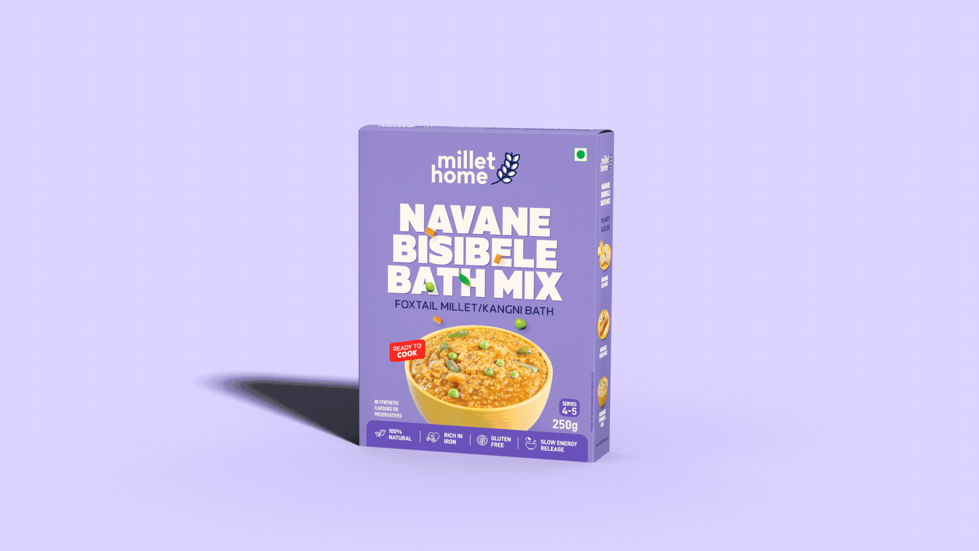
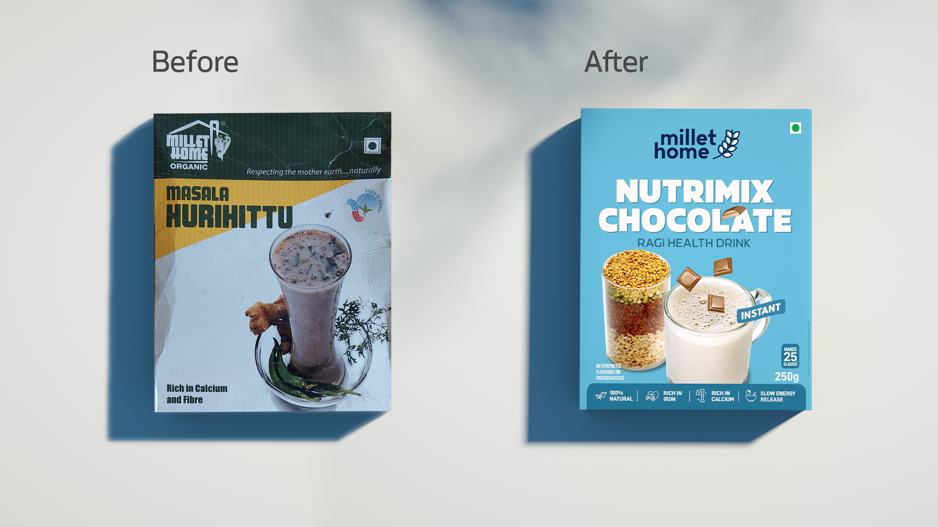
In metro cities, people tend to skip breakfast because of their hectic schedules and to compensate, they pick up ready-to-eat breakfasts loaded with preservatives. Millet Home recognized this gap and created 100% organic, non-preservative ready-to-eat food to encourage healthy eating. Although many competitors flanked them, the latter catered only to older generations, completely missing out that the demand for organic food had permeated every age group. Mellow Designs stepped in to capture the younger crowd with a visual identity that was peppy and fresh.
The packaging for Millet Home was designed in a way that all the attention-grabbing features were placed on the top of the layout. Scaling that with bright, peppy colours, we made Millet Home’s packaging fit for a brand that caters to the young crowd. We reworked the product photographs and used a modern typeface, placing the product name in front instead of the brand name.

.png)


